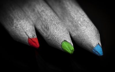
The Meaning of Colors
“Color creates, enhances, changes, reveals and establishes the mood of the painting.”
Kiff Holland perfectly enhances the importance of colors, not just in paintings and fine art, but everywhere in our life we are surrounded by them and under the influence of colors even when we are not aware of it.
Colors can sell or on the contrary, if they are used in an inappropriate way, they can send a negative message about the product. So using the right colors in web design is crucial in achieving our goals. Let’s start our experiment in this exciting world and get to know color theory in more depth.
As Cameron Chapman said: “Color theory is a science in itself.” There are certain rules of using colors, common decencies in your design that you cannot leave behind, that will help you make the decision. However, keep in mind that color theory is also very subjective. Seeing a color might mean different things to people due to cultural differences or just because of their personality. In one country a color arouses the mood and means happiness while in another it brings sadness and mourning. In addition to this, depending on the context, the same color can mean different things. It does matter what color we choose in our design.
When we choose a color, we also select a meaning, a different value and an evoked feeling with it in the same package. Colors can enhance or ease sensations like hunger, anxiety or calmness. They influence the way you feel so they are also used in therapy.
A different tone, tint, shade or by changing the saturation or value of the same hue, can evoke a completely different feeling. This is why it is a fantastic tool in the hands of the designers; everyone should exploit this wonderful apparatus. You can find the meaning of these words in my article of “Understanding Color Terminology”.
Firstly, let us start with the 12-color wheel and get to know its components one by one. This is the basic tool of creating color harmonies for which look for my article of the “Color Harmonies”.
The 12-color wheel was created by Sir Isaac Newton in 1666 while he was observing how white light would bend when it goes through the prism. His experiments led to the theory of dividing the colors into three different categories: primary, secondary and tertiary colors.
The three primary colors are red, blue and yellow. All the other colors are combinations of these three. When we mix two of these, we receive the secondary colors, green, orange and purple. Tertiary colors are the combinations of the primary and the secondary ones.
Warm colors:
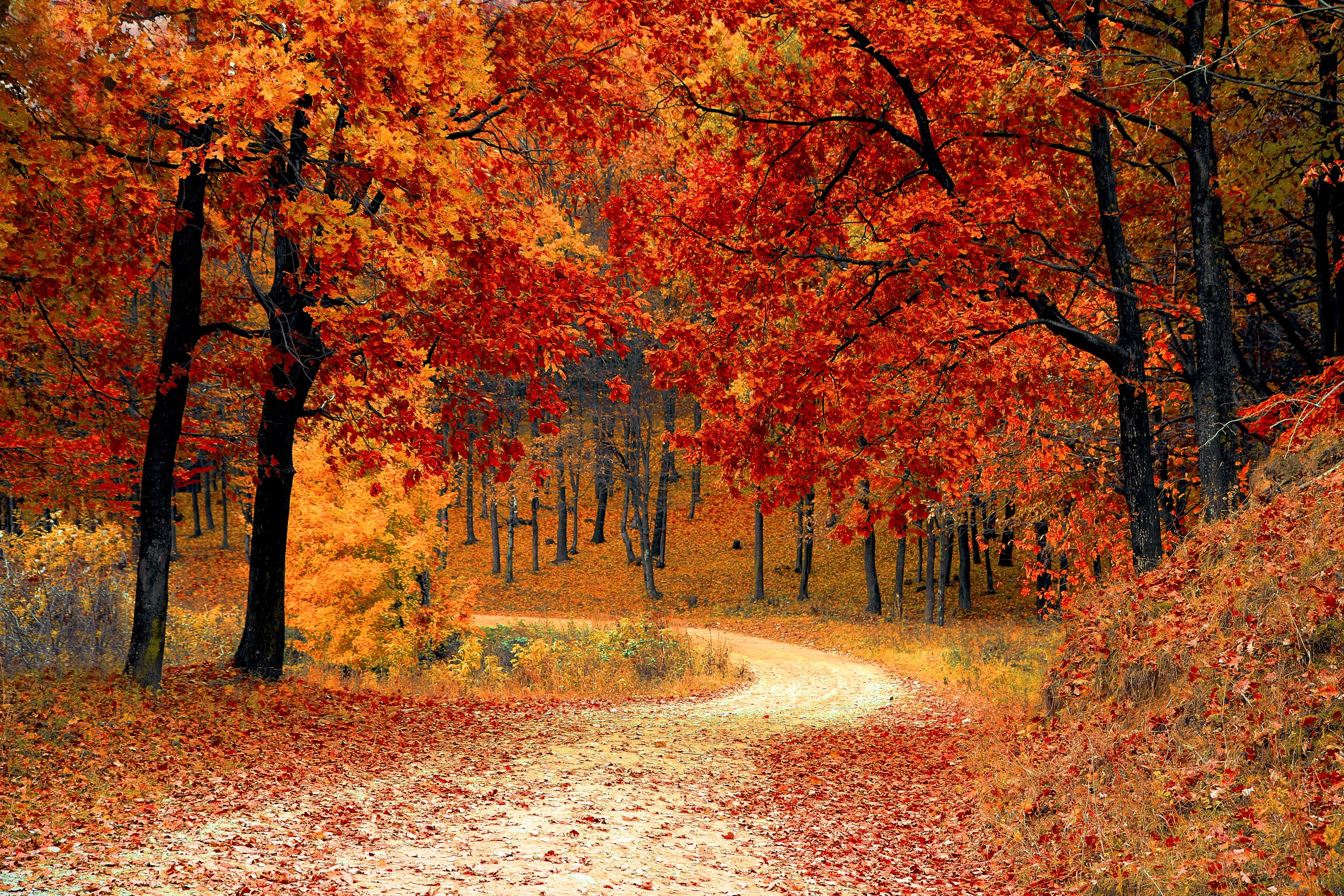
These are the colors of the sunset and the sunrise, the colors of fire, and shades of my favorite season, the fall. On the color wheel, these are between red and yellow with orange in the middle. However, the tertiary color red-purple is considered among them. If we are talking about them generally, they transmit the feeling of enthusiasm, energy, happiness, positivism, and passion.
Red
This powerful primary color is a paradox. It is associated with love, passion, and excitement, but also with wars, violence, and anger. During history, red reified Devil, but also Cupid. It indicates importance, power, and elegance, just think of the red carpet in Hollywood, and danger, as well, e.g., the stop signs, and the stop lights.
If we think of the cultural differences, while in China red is the color of happiness, good luck, and prosperity, in South Africa it is the color of mourning. It is also the color of communism.
In business, red creates urgency; it is often used in sales. Apart from urgency, red also has a certain effect on your brain. You cannot make wise decisions, when you are surrounded by red. Many stores exploit this, most likely you will spend much more than you originally planned in an atmosphere that is “bleeding”. It is also associated with food-related stuff, as well.
During your design, you have to be careful using a red hue, as it can be overwhelming easily. You should use it as an accent color and use its shades, tints, and tones.
Yellow
The brightest primary color is really energizing. This is the color of the sun. Usually it is associated with happiness, energy, liveliness, and pleasure; however it also can be the color of deceit and cowardice. Yellow is grabbing your attention; it is often used in windows, displays. It can indicate danger, too. This is the color of hunger, and many restaurants use it with the combination of red. (Just think of the red nose clown).
Yellow is also associated with curiosity, playfulness, relaxation, comfort, but with envy, too.
If we see the cultural differences, in Egypt it is the color of mourning, in India it is the color of retail, and in Japan, it is associated with courage.
Orange
This secondary color is in the middle of red and yellow on the color wheel. It is associated with autumn, the earth, the fruit with the same name, health, and vitality. It also grabs your attention, and it is the color of changes and movements. It is a great accent color on your website, especially on action buttons, as it brings attention to them and calls for action.
Orange is also associated with strength, energy, dominance, creativity, comfort, celebration, youth, and warmness.
Cool Colors
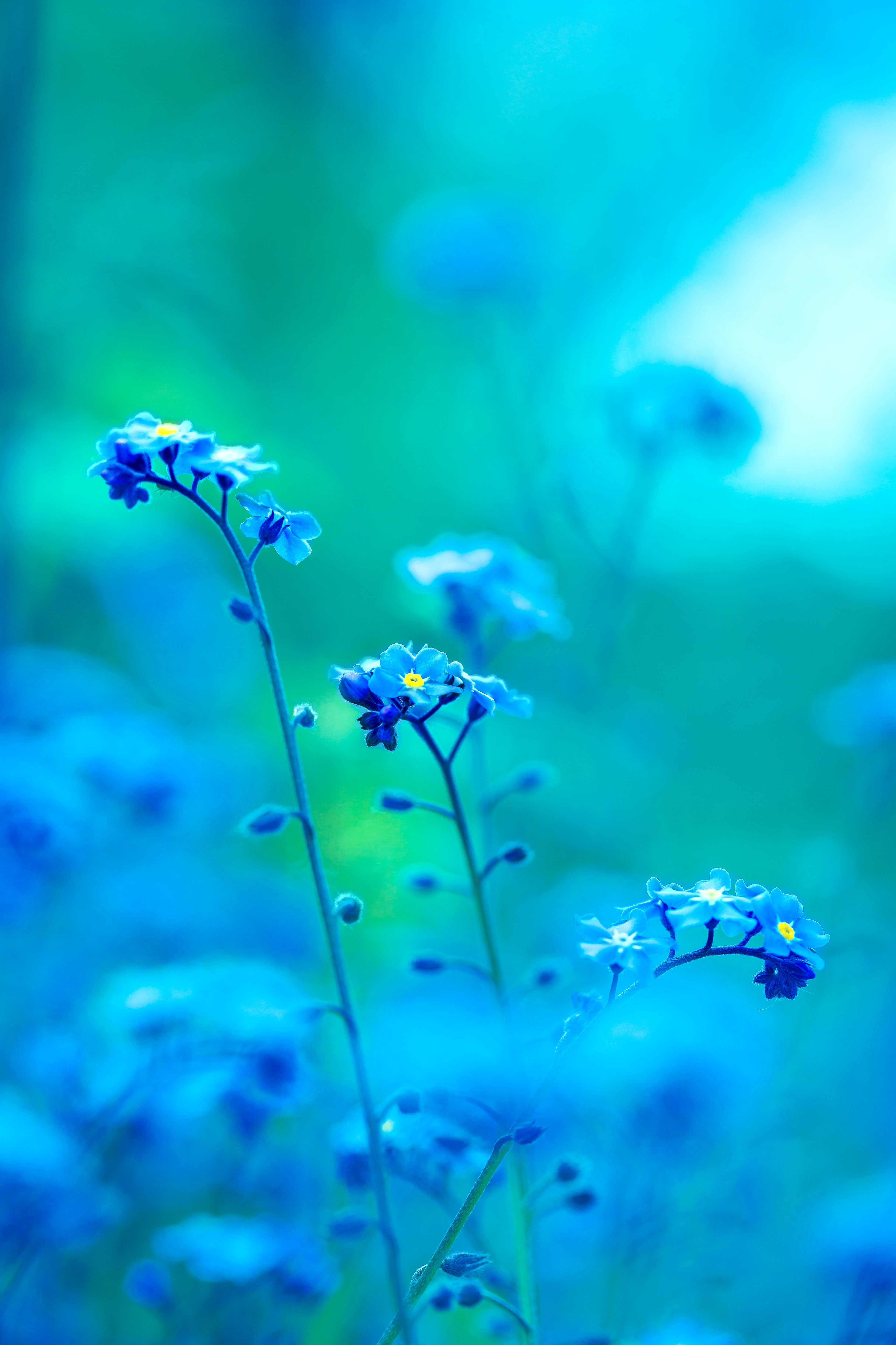
These take place on the other half of the color wheel, green, blue and purple. They are the colors of nature, the water and the night. Among them, blue is the only primary color. The others come off when we mix blue with the warm colors.
Cool colors are usually associated with relaxation, calmness, and professionalism.
Blue
When using blue in your design, you need to think of the shade, tone, and hue of the color, as they have very different meanings. While light blue is calm, relaxed, friendly, brighter blues are the opposite, they are invigorating, revitalizing. Dark blue is associated with strength, success, reliability, importance, professionalism, responsibility, thoughtfulness, stability and security. You can meet this color a lot in the business and judicial environment. It creates trust, many banks also use this color.
Navy blue is used in selling price sensitive products, while royal blue creates the feeling of urgency, it is used in impulsive buying.
Blue is also associated with spiritual meanings, e.g., Virgin Mary is usually delineated wearing blue.
It is also the color of peace, loyalty, honor, trust, conservatism, furthermore, also associated with melancholia (think of the English word “blue”), boredom, coldness.
Green
This secondary color is often associated with life, healthy lifestyle, new beginnings, harmony, balance, healthcare, durability, well-being, honesty, optimism, freshness. Of course, it is very important which shade of green you use. As it has some warm color in it, it has some attributes of the energy of yellow. Especially the brighter greens are vibrant, renewing, often used in a retro-looking design, while olive greens are more profound, more stable, closer to nature. Green is also the color of money, growth, and reliability. It is a calm and smooth color; it is often used to relax people.
Purple
This secondary color is the royal color. It became the color of wealth as for many centuries, only this dye was available, and it was costly, just rich people could afford it.
As it is the mixture of red and blue, it has both’s attributes.
While, dark purple is the color of luxury, nobility, and prosperity, lighter purples are also associated with romance, fantasy, creativity, mystery, imagination, dreams, and magic. Purple is also the color of justice, but also it is associated with sophistication, insecurity, and equivocality. It is used many times in selling anti-aging products, as well.
In Thailand, purple is the color of the mourning widows.
Red-purple is considered to be a warm color; it has energy and vitality.
Neutral colors
Last but not least, let’s talk about the neutral colors, which are usually used as a background color combining with bright accent colors; however, they can also be used by themselves. Warm and blue colors keep their main attributes even when they are seen together. But neutral colors are always influenced by the accompanying colors.
White
White is often used as a background color is design. It is simple, clean, it is popular in minimalism. It is associated with virtue, purity, innocence, virginity, peace, and goodness. In many countries brides are wearing white, and also angels are usually delineated in this color. It also means sterility, you can find this color in health care, the doctors, nurses everywhere wear white. It enhances the feeling cold, as it is also associated with ice and snow. However, if it is mixed with some warm colors, it can represent summer, as well.
Black
This paradox neutral color is usually used for typography.
On the one hand, it is associated with elegance, power, formality, strength, conservatism, tradition; however, on the other hand, it is the color of death, mourning in many Western countries, it is associated with evil, rebellion, difficulty, illegality, depression, morbidity, mystery, and the occult. Of course, it also depends on the colors it is combined with.
Gray
This conservative, but also modern color can be used instead of white in a light form, and instead of black in its darker shade. It is a common background color. Gray is considered to be moody, depressing, boring, indifferent, moderate, also formal, professional, sophisticated and the color of intelligence.
Brown
Brown is the color of earth, the wood, it is a warm color. It is often used as a wood or stone texture in design. Brown is a popular background but also used in typography.
It is associated with dependability, reliability, wholesomeness, down-to-earthness, nature, softness, fertility, comfort, stability, relaxation, confidence, reassurance, genuine and endurance.
Beige and tan
In design these colors are usually used in backgrounds, often as a paper or stone texture. It is affected by the colors it is used with, sometimes it has warm, occasionally cold feeling depending on the accent colors. It is also associated with piety.
Cream and ivory
These colors are often used instead of white, as they have the attributes of white, just a little bit warmer. Mixing them with brown, peach and green, they are commonly used in nature and earth related designs. They are also associated with history.
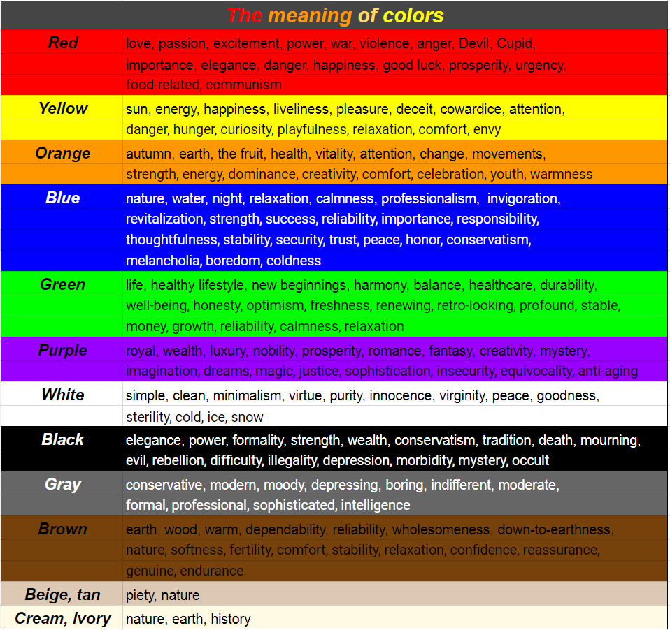
Finally, I would like to summarize the meaning of colors in a chart so that it would be more transparent:
People’s attention can be directed easily with colors because they are easy to remember. Sometimes we cannot recall anything else from a particular event just the colors which were involved.
The order of colors regarding their attention-grabbing attributes:

The order of colors regarding their identity:

Firstly, we always recognize the hues, we will only see the shades, tones later:

I would like to finish my article with Kandinsky’s words which perfectly summarizes the importance of colors:
“Color is a power which directly influences the soul.”
References:
- Smashing Magazine – Psychology of Web Design 2012, Color Theory for Designers
- David Kadavy: Design for Hackers, Reverse-engineering beauty
- Online Webdesign Tanfolyam – A színelmélet alapjai
- tigercolor.com/color-lab/color-theory/color-harmonies.htm
- munsell.com/color-blog/sir-isaac-newton-color-wheel/
- munsell.com/color-blog/munsell-hue-circle/
- Video: Blender Guru – Understanding color
- changingminds.org/disciplines/communication/color_effect.htm
Recommended posts
RGB and CMYK: Understanding color models used in design
RGB and CMYK: Understanding color models used in designDifferent devices use diverse color methods. Two color models are usually used in design, RGB and CMYK. RGB stands for the three additive primary color, Red, Green, and Blue. It is used for anything, that is...
read more
Understanding Color Terminology
Understanding Color Terminology Using colors in your design is essential, and if you would like to do it expertly, firstly you need to know some basic concepts in color theory. For creating fabulous color schemes, you have to use the thesaurus of the hues, their...
read more
Color Harmonies
Color Harmonies In my previous article, "The Meaning of Colors" we discussed the exciting world of colors, we understood that using a wide range of shades, tones, and tints of the same hues, can evoke different feelings, that is why it is vital to always use the...
read more