Understanding Color Terminology
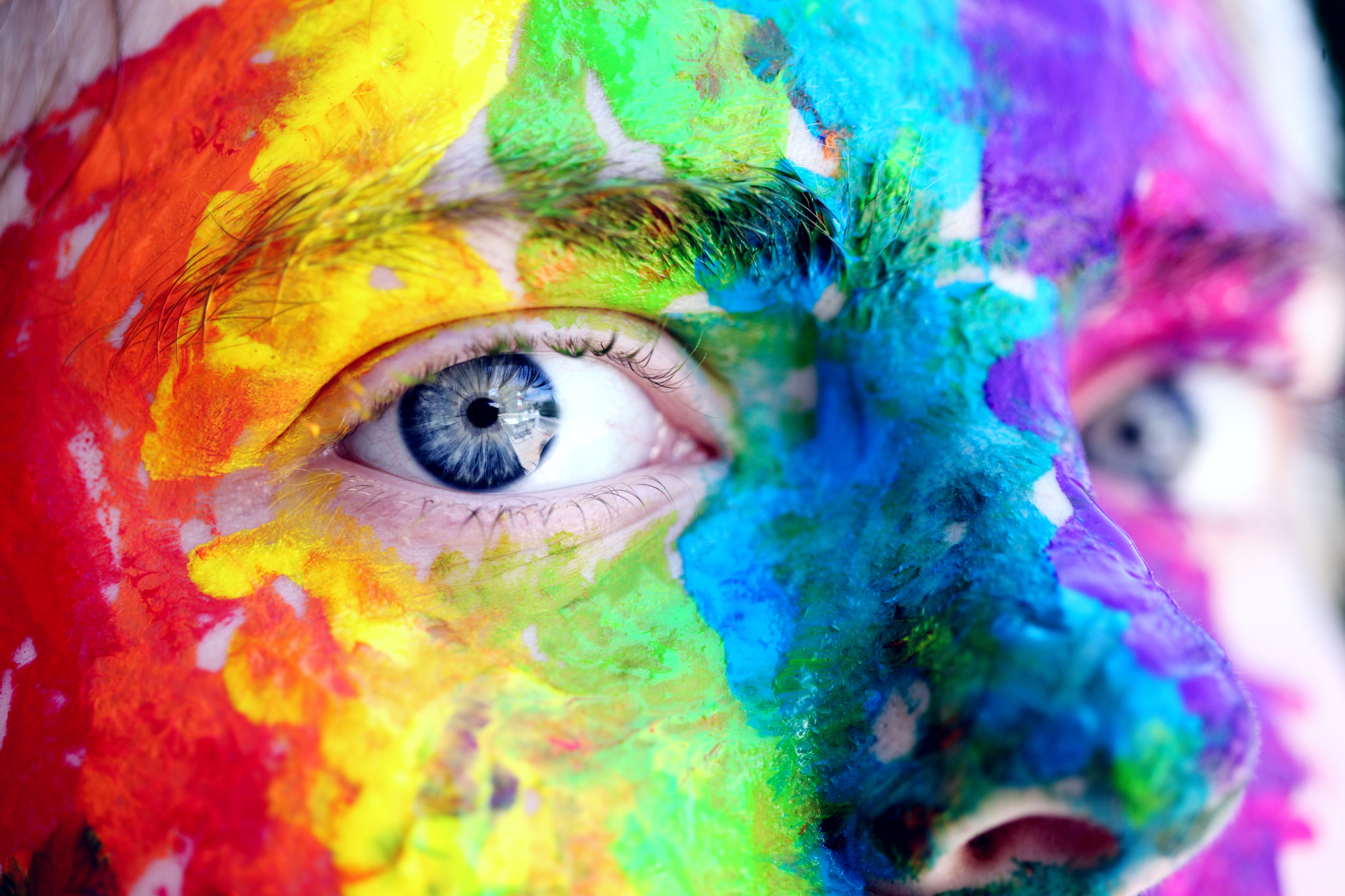
Using colors in your design is essential, and if you would like to do it expertly, firstly you need to know some basic concepts in color theory. For creating fabulous color schemes, you have to use the thesaurus of the hues, their different saturation, value, and chroma levels, you have to know how a pure hue will change when you add gray, black or white to it. Let’s see the explanation of these concepts.
Hue
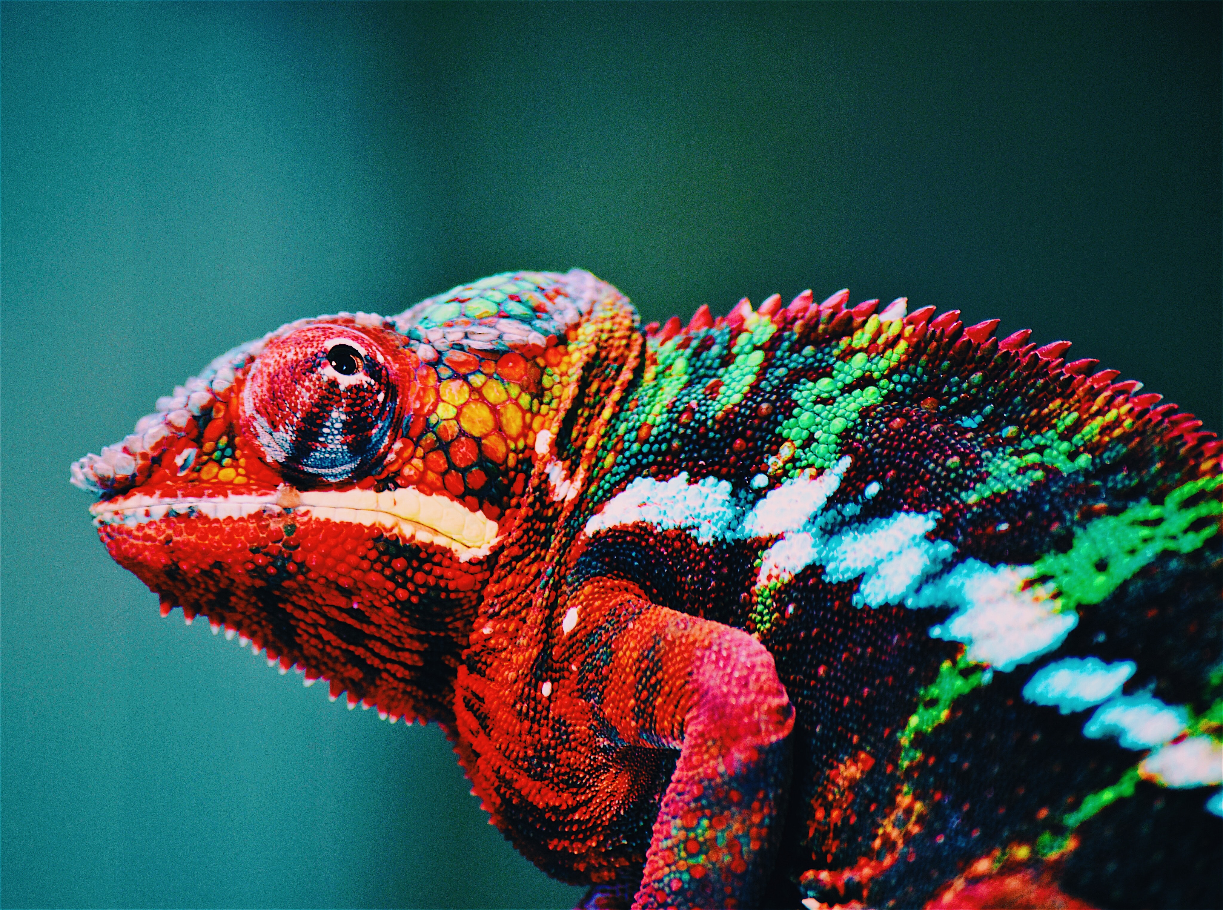
Hue is that attribute of the color how we distinguish the different colors from one another. Each color on the color wheel is a hue. It is important to know that e.g. if we are talking about blue if it is shaded with black, tinted with white or toned with gray, we are still talking about the same hue. Basically, it is the object’s color, as we see it. In your design, if you use pure hues together, it gives a playful atmosphere to it.
Chroma
Chroma is the purity of the color. It describes the brightness of a color compared to white. Low chroma level colors are called “weak”, while colors of higher chroma are called “strong” and “vivid”. In your design, use high chroma levels in moderation, just for highlights. Combine it with lower chroma levels, it gives a pleasing experience to the eye. When you mix a color with any neutral color, e.g. black, white or gray, you reduce the chroma or colorfulness. The high chroma has no added black, white or gray in it.
Saturation
It is similar to chroma, but it is not quite the same. Saturation is the intensity of colors, how a hue appears in different lighting conditions. Saturation level, the colorfulness, and brightness depends on how the object and its area remits light to the eye. It refers to the color’s strongness or weakness. Comparing to chroma, when you use low saturation you will get heavier, stronger colors, while if you have low chroma levels, you get light, weak colors. In your website, if you combine low and high saturation of the same hue, it gives an elegant feeling to your design. If you use similar muted saturation levels, you create a soft and cohesive-looking atmosphere.
Value
It can also be called the lightness or darkness of the color. Lighter colors have higher values than darker colors. E.g., white has the highest value; yellow has a higher value than dark blue or purple and black has the lowest value. It can be affected by the colors accompanying your hue, e.g., on a dark background, the same color looks lighter than on a lighter background. The use of different values of the same hues in your design gives enough contrast which is pleasing to the eye. When you apply similar value but different hues, you get a lively, energetic atmosphere, it is a popular background option.
Shade
In common language, “shade” can be generalized, it is often used for any varieties of a color, however, technically they are all shades, tones, tints or just different hues. A shade is created when black is added to the pure hue making it darker. In design different shades of the hues can be used instead of black and in this case act as neutrals. When using shades in your design, make sure to have enough contrast between them, best to combine shades with tints and tones to avoid a heavy look.
Tint
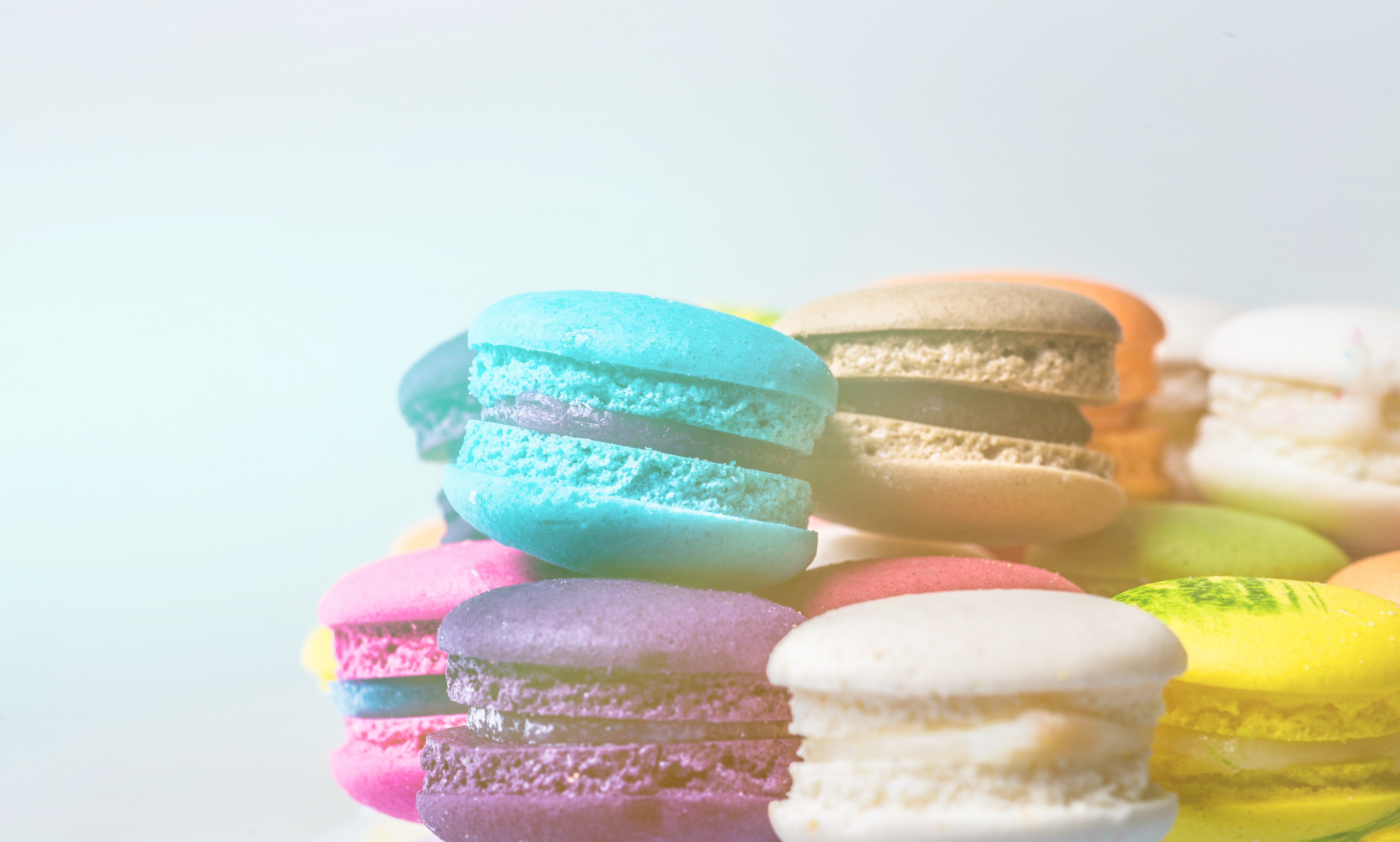
The addition of white to a hue for lightening creates tints. They are sometimes called pastel colors. Just like tones, tints work well in vintage designs. Also, they are popular in feminine designs, and in websites regarding babies. Using tints in backgrounds creates a sophisticated look. When creating the sky motif, blue tints are used with fondness. They are also popular in watercolor designs.
Tones
They are created when gray is mixed with the pure hue. Tones can also be produced by mixing two complementary colors. Even when you both give white and black to the pure color, you are creating a tone. Of course, it depends on the hues, but tones provide an elegant, vintage-looking, antique or hand-made feeling to the design. Tones, tints, and shades might be more popular in designs than pure hues as they give a softer-looking atmosphere.

Weight
Colors have their level of strength, weight. Lighter colors are considered to be visually lighter in weight than darker colors. The balance is principal among them, a more massive amount of light color necessary to balance out a small amount of dark, heavy color.
In your design, use the above concepts to guide the viewer, to tell the story, to change the mood of your design. E.g., in comedy movies, they use bright colors with high chroma levels, high value to bring joy and happiness. While in grave scenes the highly saturated colors, low chroma levels are associated with sadness. You can perfectly see this in the movie “Up”.
With high chroma levels, the bright colors can draw attention to the essentials.
I would like to finish my article with Hans Hofmann’s words which perfectly summarizes the importance of using colors in your design:
.“In nature, light creates the color. In the picture, color creates the light.”
References:
- munsell.com/color-blog/munsell-hue-circle/
- housepaintingtutorials.com/color-terminology.html
- munsell.com/about-munsell-color/how-color-notation-works/munsell-hue/
- munsell.com/about-munsell-color/how-color-notation-works/munsell-chroma/
- en.wikipedia.org/wiki/Colorfulness
- en.wikipedia.org/wiki/Tints_and_shades
- Smashing Magazine – Psychology of Web Design 2012, Color Theory for Designers
- Online Webdesign Tanfolyam – A színelmélet alapjai
- Video: Blender Guru – Understanding color
Recommended posts
Designing for the mind: what makes a design look better
Designing for the mind: what makes a design look better"Once you can name something, you're conscious of it. You have power over it. You own it. You're in control." I choose to start my article with Robin Williams' words. As many gorgeous designs, art is created on an...
read more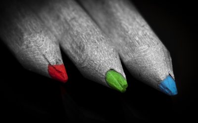
RGB and CMYK: Understanding color models used in design
RGB and CMYK: Understanding color models used in designDifferent devices use diverse color methods. Two color models are usually used in design, RGB and CMYK. RGB stands for the three additive primary color, Red, Green, and Blue. It is used for anything, that is...
read more
Color Harmonies
Color Harmonies In my previous article, "The Meaning of Colors" we discussed the exciting world of colors, we understood that using a wide range of shades, tones, and tints of the same hues, can evoke different feelings, that is why it is vital to always use the...
read more