Designing for the mind: what makes a design look better
“Once you can name something, you’re conscious of it. You have power over it. You own it. You’re in control.”
I choose to start my article with Robin Williams’ words. As many gorgeous designs, art is created on an unconscious level, but if a designer continues doing so, his or her decisions seem to be entirely random. Some principles help us to make a design attracting, fascinating that will grab people’s attention, and now we will see why.
A design has various effects on diverse people because our brain works differently. There are 30 particular parts of our brain that process and recreates the image we see. When we look at a design, each one of us has a different vision of it, and that is why it enhances various feelings in us.
A well-created design is not just beautiful, but also important in communication. Just like an ugly handwriting, the lack of design can also lead to miscommunication.
Now let’s explore those principles that will make our design look better.
Gestalt principles of grouping:
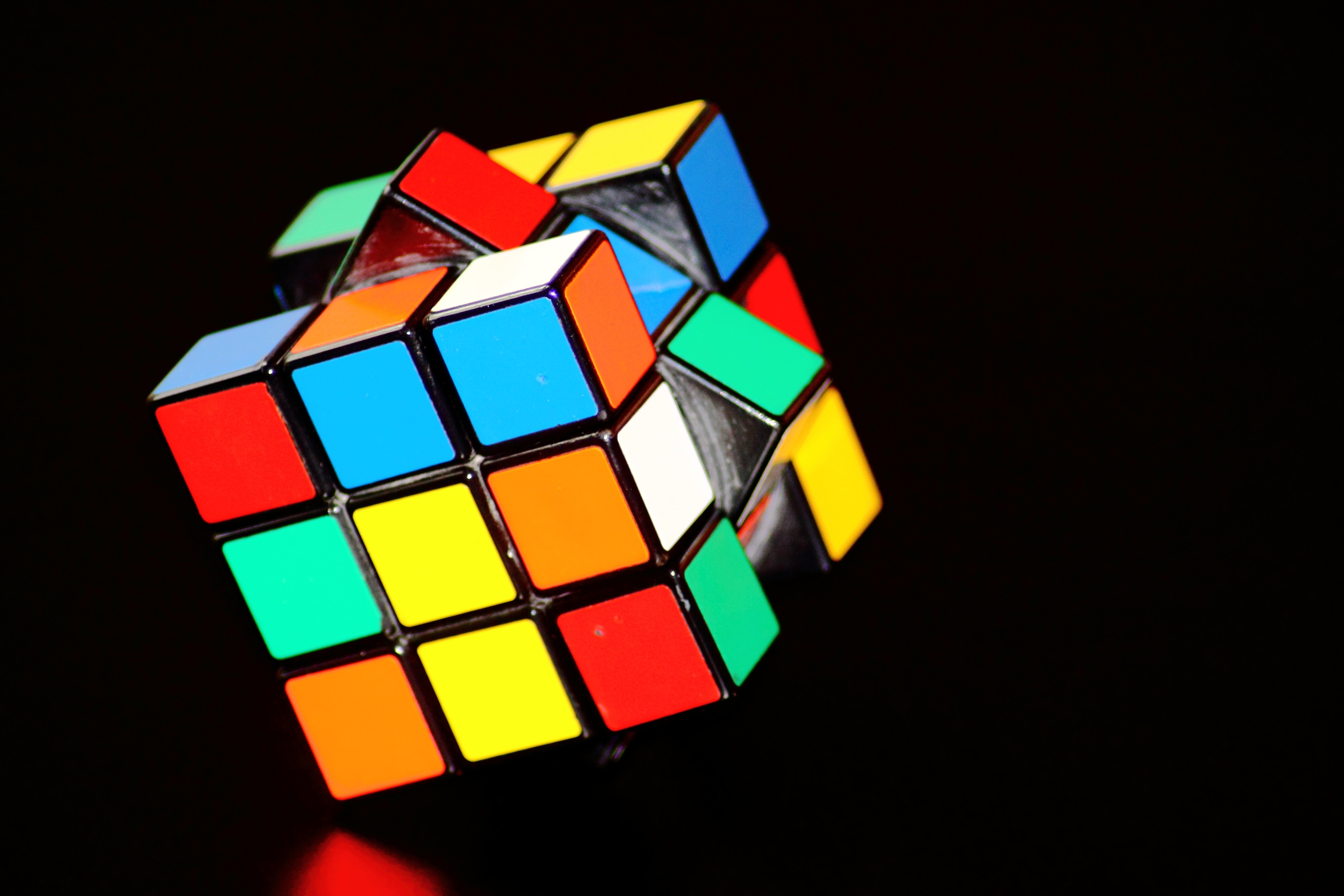
Gestalt means “shape” or “figure”. In the early 20th century, Koffka, Wertheimer, and Köhler established the principles that explain perception as a function when objects and figures are apprehended as a whole, not just independent parts e.g. when you see a bike, you see a bicycle, not just pedals and wheels. Its techniques are playing with the mind’s natural habit to try to find connections in items. They are meaningfully grouped together in different ways in their environment.
Gestalt psychology can be divided into the following design principles:
Figure-ground: it defines how we organize our perceptions in relation to foreground objects or figures, which are clearly defined, e.g. a tree, and the background, which is usually vaguely defined, e.g. the sky.

Symmetry: Symmetrical objects will be seen over the ground, around a central axis. Usually, these pictures have two different ways of perception and our mind is flipping back and force between these meanings. Usually, we perceive symmetrical objects as more beautiful ones, but it is not always the case.
Similarity: We perceive objects with a similar appearance (e.g. shape, size, color, texture, …) as belonging together.
Proximity: The idea of perceiving objects that are close to each other in space or time.
Closure: The idea that our mind closes incomplete objects as complete. Even when we only see just parts of a figure, we perceive it as a whole.
Have you seen the Fedex arrow in the logo? If you once see it, good luck not seeing it anymore. (I will help you, take a close look between the “E” and the “X” 😉 ) It is also used in creating feelings, which we know that sending the message via connecting it to a feeling will stick in the brain. Seeing just pieces of an object stimulates the mind more than giving it the whole picture. It is forcing it to imagine how the element looks like. They use this in movies, as well, e.g. creating a mysterious, even scary atmosphere by showing only the feet of the killer.

Just to mention an ancestral example, as well. When our ancestors saw a part of a predator, their mind immediately completed the picture, they had to react to danger right away even if they did not have the whole information.
Continuity: The idea that we follow objects that are aligned until they are interrupted. You will see the simplest, smooth path available. Why overcomplicate things when it can be done easily, as well right? In addition to this, you are able to distinguish objects even when they clearly overlap. You can organize the lines and curves of each figure.
Common Fate: When you see moving objects in design, the ones that are moving together you will perceive them as belonging together e.g. a flock of birds. You see the individual birds, but as they are moving together, you perceive them as one flock. Even when they meet with another flock, you still see the two separate ones, who have their own directions.

These principles are vital in design to create meaningful, complete, whole visuals and make it easier to understand and interact with the interface.
When the Gestalt principles are ignored in design, it gives an incomplete feeling. You feel that something is out of place.
You can observe the Gestalt principles in many greatly built websites, also the lack of them, when they can also help us identify design problems. When a website has too complicated and difficult interfaces, these laws will help you to find the problem and give you solutions.
Let’s continue exploring further principles that will help us to create the best design possible.
Balance
Like in every walks of life, balance is one of the most important principles in design, as well. Sometimes it is not easy to develop, however it is worth the effort, as it will give your website harmony while still reaching your goal.
Balance means that your design does not get to either side of extreme. Using too many colors, or no colors at all will not help your work.
Depending on your design, sometimes you would like to reach symmetry, sometimes asymmetry is the better choice. The importance is always finding the balance in the visual weight. There are many tools to help you pull off the best results, e.g. colors, size, the addition or removal of some elements.
Symmetrical balance is easier to create, it gives a more serious, elegant look for your website, while the asymmetrical balance is more playful, more exciting.
You can see in all the best-looking websites how they have a well-constructed balance in them.

Grids and proportions
Grids are horizontal and vertical rulers, that will help you to create balance on your website. They will help to organize the various elements in your design. The proportional relationships will decide what is important and unimportant on your website, it is the consequence of how something relates to the others. It will help to guide the attention to the essentials, guide the eye, making it easier to absorb. Just think of the columns.
The most beautiful proportion in the world is considered to be the Golden Rule or Ratio. It has fascinated many artists, scholars, mathematicians through history. The Golden Ratio has proportions of approximately 1:1,618, which explains why the main content of a website is usually equal to the websites’ width divided by 1,618, which is the phi in mathematics.
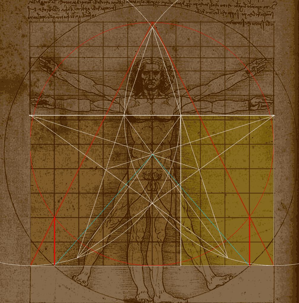
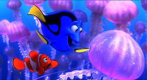
The Golden Ratio is in quite a close relationship with the Fibonacci sequence. It means that each number is the sum of the two previous numbers, like 0,1,1,2,3,5,8,13,21,34,55,..If you divide a number by its following number in the sequence, you get a number around 0,6, which is close to the percentage of the Golden Ratio. The Fibonacci sequence and the Golden Ratio creates logarithmic spirals. The Golden Ratio can be found in nature, as well. E.g. Its proportion is in a close relationship with the proportions of the human body. You can easily observe this in Leonardo da Vinci’s drawing, the Vitruvian Man. Also you can see this in many fish, such as the clown fish or the powder blue tang. No wonder why they used in the cartoon of Finding Nemo these two type of fish, which has the relation to the most beautiful proportion.
However, you can also find it on many websites, how the content is built according to the logarithmic spiral, such as the redesigned Twitter page.
Apart from the Golden Ratio, there are many other proportions that can help to create visually pleasing, clean compositions.
The Root 2 Rectangleis a proportion of 1:1,41, which is the proportion of the official ISO paper size.
The Golden Ratio, Fibonacci sequence or Root 2 Rectangle can be difficult to calculate during your design. This is why there are two more proportions which are commonly used, especially when working with a grid.
According to the Rule of Threewhen there are three of something, the result is more exciting, funny, in design it is more pleasing to the eye. Anytime if you have three of it, anyhow you divide it the proportion is 2:3 which is 0,66. This rule is similar to the Golden Ratio, it is just easier to work with.
They use this rule in many stories, as well, e.g. The three little Pigs, or the 17 Camels and 3 Sons.
The 3:4 rectangleis a beautiful proportion, as well, it can be found in art, music, Latin dances, and nature, as well. Generally the proportions of the shells of snails are considered to have relationships with the Golden Ratio, however it is not true, because their proportion is composed by the rule of the 3:4 rectangle. This is popular in design, beautiful and easy to carry-out.
Peak shift
Peak shift helps the mind perceiving the differences between elements, especially when they are overdone. E.g. when you see caricature and a realistic drawing of a person, you would feel the caricature more resembles to the person. Or when you ask the children whether they would like to have two scoops of ice cream or five, most likely they will choose five, even if it is too much.
In design by exaggerating some attributes can be visually more appealing to the eye. You can e.g. try this with lighting. Playing with the shadows and reflections can help to bring the attention to the essentials.
Isolation
According to this principle, our mind reacts stronger when only absorbs the essentials, what really matters without the irrelevant details. Such as, when you see a full-color photograph of a tree and a sketch about it, the drawing just with the silhouette is more powerful, it communicates the message in a more simpler way. It is a tree. That is it.
White or negative space
I would like to mention white space here, as well as one of the most important principles. It is vital to leave some room empty in your design. It gives the website some breathing space. You can also use this tool for highlighting an essential thought by leaving some area empty around it.
Contrast
First of all, we use contrast because it is pleasant to the eye. It means that two elements of the design are different. It can be between background colors and text colors, big, bold font in the header combined with small sans-serif font in the body text. It can be light versus dark, dynamic versus static, rough texture versus smooth texture, large image versus small image. Using contrast helps to grab attention and focus on the essential part of the website. Use it with the Gestalt principles to create attention-grabbing, organized and easily working websites. E.g. you can combine continuity and contrast e.g. with black and white shapes creating a rhythm to follow.
Of course, you need to be careful using too much contrast can result in a jarring visual experience. Like everywhere, here, as well balance is the key.
Generic viewpoint
Using a more generic viewpoint is usually more appealing to the eye. It is like in isolation, the more simple, the better, the quicker to apprehend.
Metaphor
“A metaphor is a figure of speech that, for rhetorical effect, directly refers to one thing by mentioning another. It may provide clarity or identify hidden similarities between two ideas.” It is fondness used in poetry, however, now we are talking about a little bit different metaphor, the visual metaphor which is used in design.
As Francisco Inchauste said: “The metaphor is a sort of mental tunnel between two objects that at first seem unrelated.” Our brain creates this tunnel by making an association between the two elements. Using great metaphors which are universal, easily understandable is vital in design because even before we are aware of it, our mind has already made the association and received it.
Metaphor in web design also means familiarity. There are many different elements which help to reduce the gap between real and virtual life. E.g. using a bookshelf on a website for a library. Metaphors also help us find what we need quicker. When we are looking for something, we quickly scan the website to find the familiar icon as fast as possible. Such as if we are looking for contacts usually we look for a telephone or an envelope icon. In addition to this, when we see red or yellow text with exclamation marks we instantly know there must be an error.
Just to mention an easy metaphor used in nearly all websites. This is the button. Which is not actually a button, it is just pixels, yet everybody knows that it is needed to be clicked on.
Color harmonies
Colors, that you are using in your design have a deeply emotional, psychological significance. Using the right colors in web design is crucial in achieving your goals. As it is proven, colors can sell or on the contrary, if they are used in an inappropriate way, they can send a negative message about the product. It is also important to have harmony among the colors that you use. Too many bright colors can kill your design. You can dive into this topic in my previous articles, “The Meaning of Colors” and the “Color Harmonies”.
As designers, we can use the above principles to increase attraction to the design, and make our websites more charming, yet more memorable. As Jef Raskin said: “As far as the customer is concerned, the interface is the product.” Our goal is to connect our target audience to the website in order to connect to the product.

Reference:
- en.wikipedia.org/wiki/Principles_of_grouping
- jotform.com/blog/how-to-make-a-web-design-look-good/
- canva.com/learn/diy-design-rules/
- uxplanet.org/design-principles-that-help-you-shape-the-best-user-experience-260ad3a1bb83
- Smashing Magazine: Psychology of Web Design
- David Kadavy: Design for Hackers, Reverse-engineering beauty
- Video: HubSpot: Gestalt Psychology and Why It’s Essential for Good Design
- Video: LinkedIn Learning: Interaction design and Gestalt Principles | lynda.com tutorial
- sitepoint.com/principles-of-design-contrast/
- canva.com/learn/contrasting-colors/
- en.wikipedia.org/wiki/Metaphor
- webdesign.tutsplus.com/articles/using-metaphors-in-web-design–webdesign-4752
- webdesignerdepot.com/2015/10/how-to-use-balance-in-web-design/
Recommended posts
Understanding Color Terminology
Understanding Color Terminology Using colors in your design is essential, and if you would like to do it expertly, firstly you need to know some basic concepts in color theory. For creating fabulous color schemes, you have to use the thesaurus of the hues, their...
read more
Color Harmonies
Color Harmonies In my previous article, "The Meaning of Colors" we discussed the exciting world of colors, we understood that using a wide range of shades, tones, and tints of the same hues, can evoke different feelings, that is why it is vital to always use the...
read more
The Meaning of Colors
The Meaning of Colors "Color creates, enhances, changes, reveals and establishes the mood of the painting.” Kiff Holland perfectly enhances the importance of colors, not just in paintings and fine art, but everywhere in our life we are surrounded by them and under the...
read more